
Minard’s Flow Map of Napoleon’s Invasion of Russia
Not anyone is able to read and understand the data in just numbers, therefore is it is of crucial importance to find new ways to represent the data in comprehensible ways. This is when graphs and data visualization comes in. It is now easier than ever to create a graph from data, the challenge mostly comes in the form of cleaning the data and ordering it. With the help of Excel or libraries like MatPlotLib, it becomes really simple. Of course, is has not always been like this.
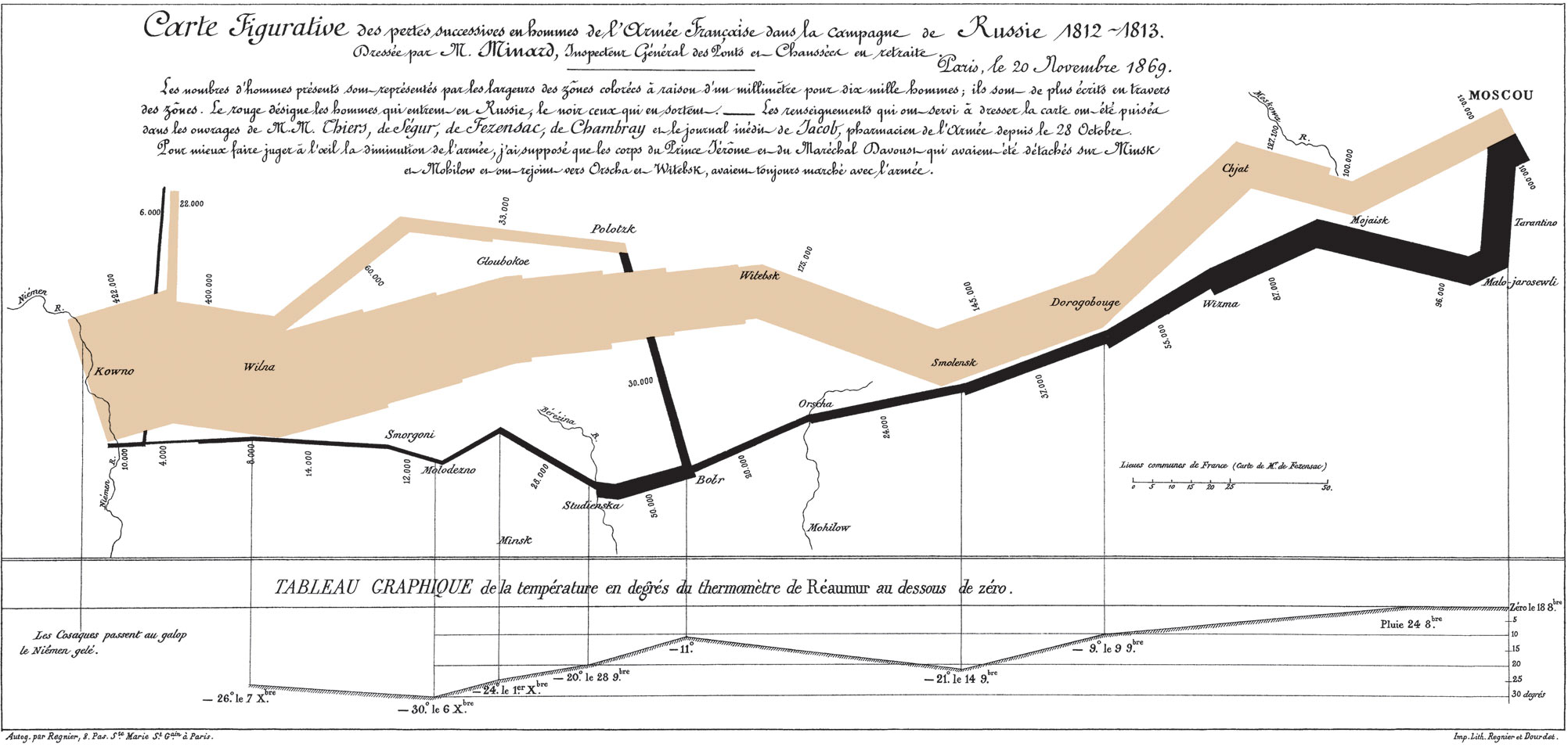
Born in 1781, Charles Joseph Minard was French engineer famous for his conrtibution to the field of information graphics. The colmination of his work is shown in the flow map above. It has been called “the best statistical graph ever drawn”. It was created in 1869, when Minard was over 80 years old, and it shows the march of Napoleon’s army into Russia.
Napoleon invaded Russia June of 1812 with almost 700,000 men. This army is shown by the yellow column. The campaign was a disaster, to say the least. Napoleon had hoped to defeat the Russian army in a decisve battle. It did not go as planned as the Russian army coopted for a scorched earth tactic, bruning all possible food and shelter for the Napoleonic army as it marhced towards the capital.
The yellow column is shown growing thinner and thnner as they advance, until it begins its retreat, shown by the balck column. Its numbers reduced to a mere shadow of what once was.
Minard masterfully isplays six types of data in two dimensions: the number of Napoleon’s troops; the distance travelled; temperature; latitude and longitude; direction of travel; and location relative to specific dates.
Not only is the flow map beautifully made, it is incredibly easy to comprehend even if one does not understand the annotation in french.